v2 banner design gallery
Eight example designs for the v2 Cookie Compliance banner, in both of its styles, standard and compact. Each one is a screenshot of the real v2 widget showing that design. The build checks every colour pair a visitor reads on the v2 banner's first layer at WCAG AA (4.5:1), and the level pill borders at 3:1.
These designs are for the v2 banner, which is opt-in. For the default v1 banner, see the v1 banner design gallery.
What v2 is
v2 is the new banner engine. It is opt-in, per app: an app uses the v1 banner, the default, until its owner switches it to v2, and it can be switched back the same way.
The v2 first layer offers the consent levels as buttons, Private, Personalized and (when the app offers three choices) Balanced, with Customize last. There is no Accept or Save button: choosing a level is the choice, and nothing is selected until the visitor picks one. Customize opens the categories.
Standard and compact
v2 has two styles, set with config.bannerStyle (a config key, not a design key):
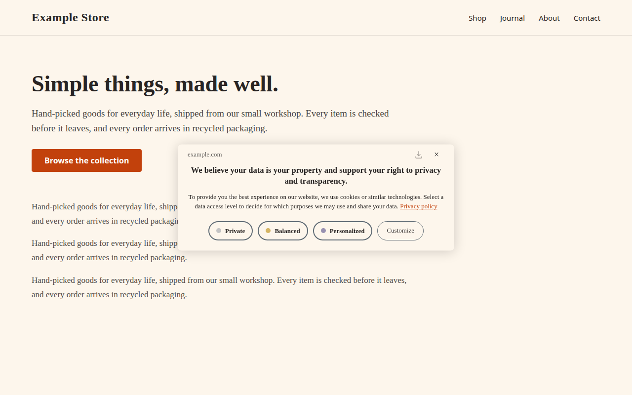
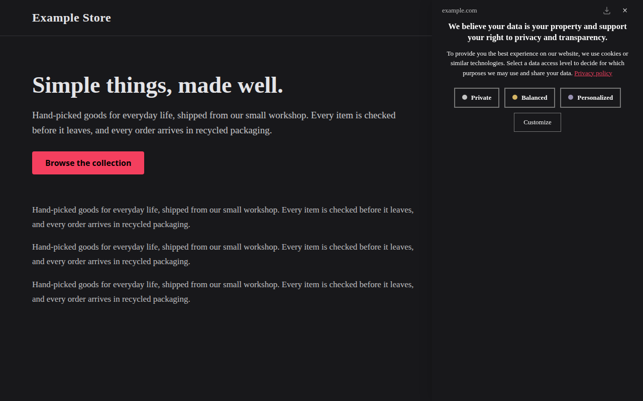
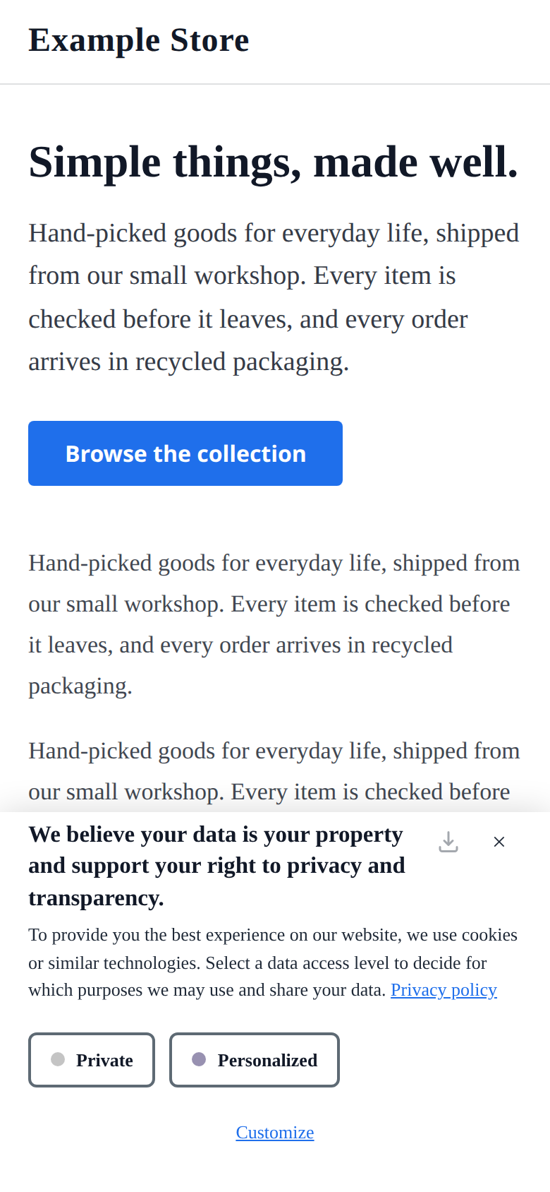
- Standard (the default): the site's domain in the top row, the heading and message below it, then the level buttons, then Customize. Balanced shows only when the app offers three choices (its number-of-choices setting); with two, standard shows Private and Personalized. On screens 480px wide or less the level buttons and Customize stack into one full-width column.
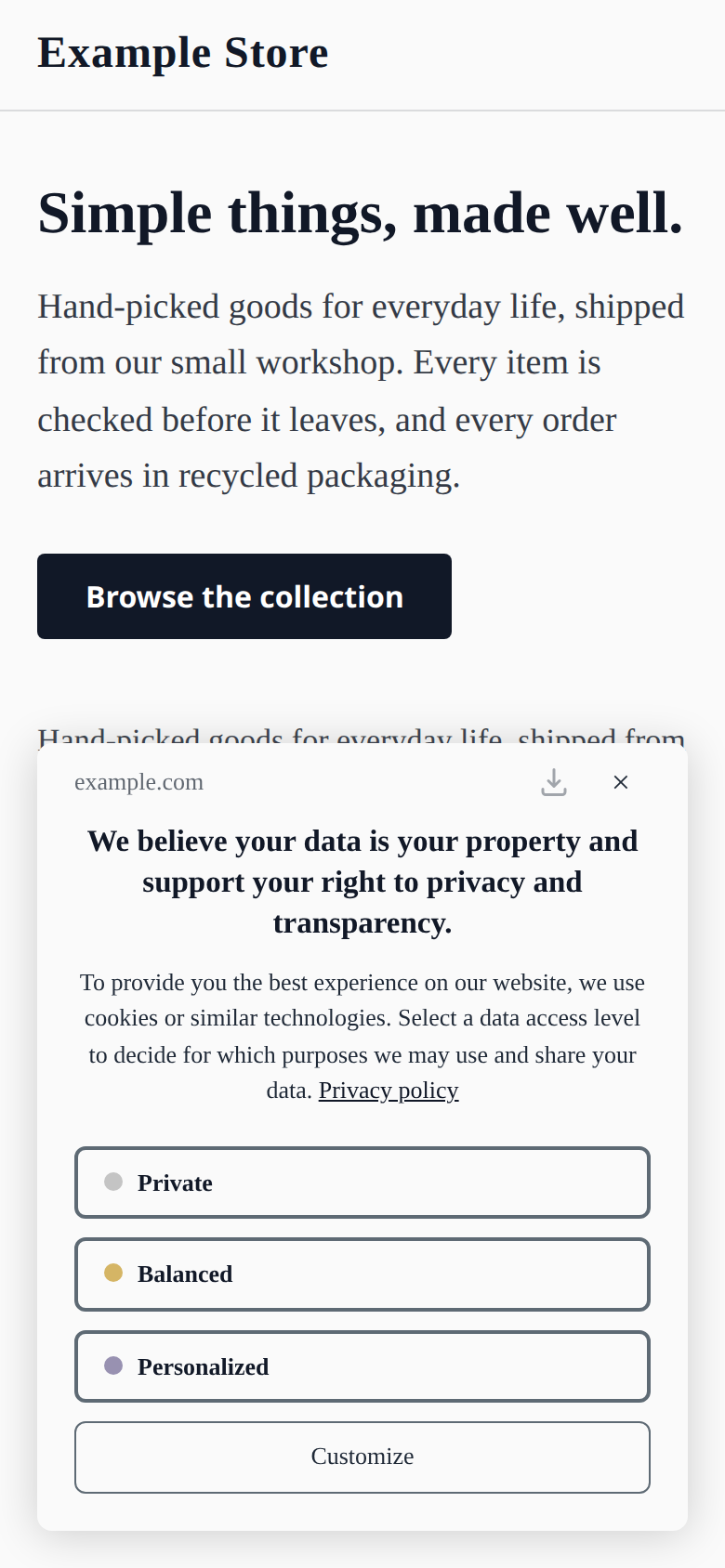
- Compact: the first layer offers Private and Personalized only (Customize still lists every category), and the heading moves into the top row in place of the domain. At
positiontop or bottom withdisplayTypefixed, on screens 1200px wide or more, the whole banner is a single-row bar. On screens 480px wide or less, Customize becomes an underlined link inprimaryColor.
The examples use the default behaviour settings. On a live banner, the number of choices, the close button and which links show depend on the app's settings and the visitor's region.
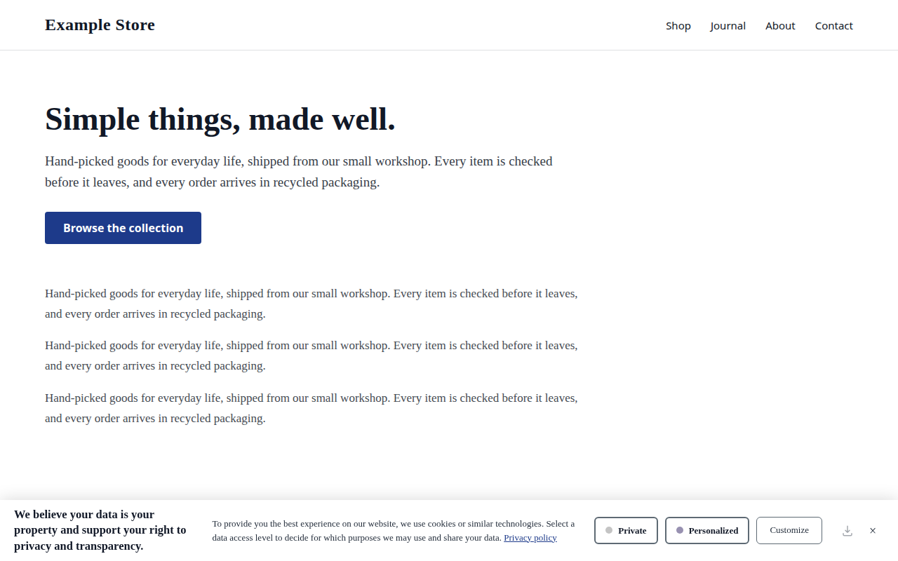
Design and config JSON
{
  "config": {
    "bannerStyle": "compact"
  },
  "design": {
    "position": "bottom",
    "displayType": "fixed",
    "bannerOpacity": 1,
    "primaryColor": "#1d3a8a",
    "btnTextColor": "#ffffff",
    "bannerColor": "#ffffff",
    "borderColor": "#5e6a74",
    "textColor": "#1f2937",
    "headingColor": "#111827",
    "btnBorderRadius": "6px",
    "textSize": "13px",
    "headingSize": "15px"
  }
}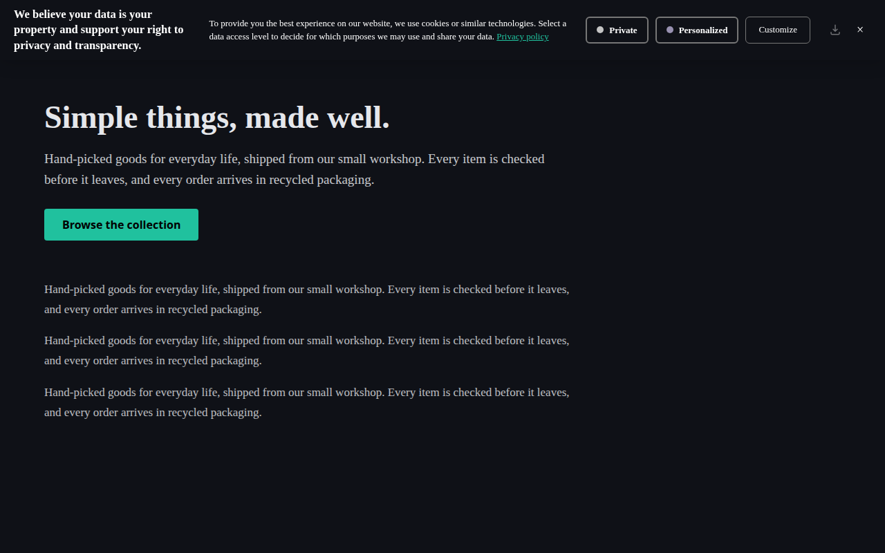
Design and config JSON
{
  "config": {
    "bannerStyle": "compact"
  },
  "design": {
    "position": "top",
    "displayType": "fixed",
    "bannerOpacity": 1,
    "primaryColor": "#20c19e",
    "btnTextColor": "#000000",
    "bannerColor": "#0f1117",
    "borderColor": "#767676",
    "textColor": "#ffffff",
    "headingColor": "#ffffff",
    "btnBorderRadius": "6px",
    "textSize": "13px",
    "headingSize": "15px"
  }
}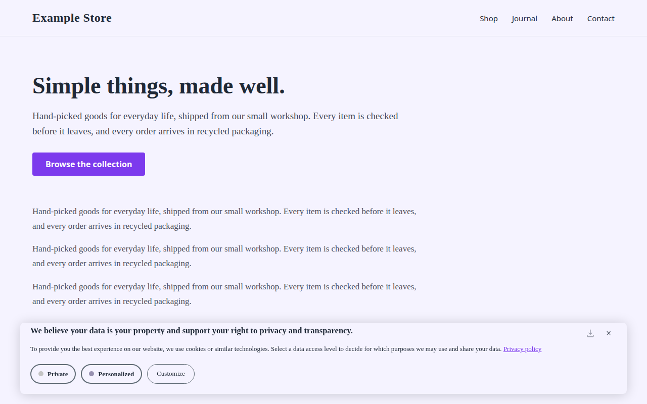
Design and config JSON
{
  "config": {
    "bannerStyle": "compact"
  },
  "design": {
    "position": "bottom",
    "displayType": "floating",
    "bannerOpacity": 1,
    "primaryColor": "#7c3aed",
    "btnTextColor": "#ffffff",
    "bannerColor": "#f5f3ff",
    "borderColor": "#5e6a74",
    "textColor": "#1f2937",
    "headingColor": "#1f2937",
    "btnBorderRadius": "25px",
    "textSize": "13px",
    "headingSize": "15px"
  }
}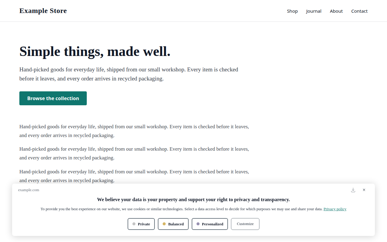
Design and config JSON
{
  "config": {
    "bannerStyle": "standard"
  },
  "design": {
    "position": "bottom",
    "displayType": "floating",
    "bannerOpacity": 1,
    "primaryColor": "#0f766e",
    "btnTextColor": "#ffffff",
    "bannerColor": "#ffffff",
    "borderColor": "#5e6a74",
    "textColor": "#1f2937",
    "headingColor": "#111827",
    "btnBorderRadius": "6px",
    "textSize": "13px",
    "headingSize": "15px"
  }
}
Design and config JSON
{
  "config": {
    "bannerStyle": "standard"
  },
  "design": {
    "position": "center",
    "displayType": "floating",
    "bannerOpacity": 1,
    "primaryColor": "#c2410c",
    "btnTextColor": "#ffffff",
    "bannerColor": "#fdf6ec",
    "borderColor": "#5e6a74",
    "textColor": "#292524",
    "headingColor": "#292524",
    "btnBorderRadius": "25px",
    "textSize": "13px",
    "headingSize": "15px"
  }
}
Design and config JSON
{
  "config": {
    "bannerStyle": "standard"
  },
  "design": {
    "position": "right",
    "displayType": "fixed",
    "bannerOpacity": 1,
    "primaryColor": "#f43f5e",
    "btnTextColor": "#000000",
    "bannerColor": "#18181b",
    "borderColor": "#767676",
    "textColor": "#ffffff",
    "headingColor": "#ffffff",
    "btnBorderRadius": "0px",
    "textSize": "13px",
    "headingSize": "15px"
  }
}
Design and config JSON
{
  "config": {
    "bannerStyle": "compact"
  },
  "design": {
    "position": "bottom",
    "displayType": "fixed",
    "bannerOpacity": 1,
    "primaryColor": "#1f6feb",
    "btnTextColor": "#ffffff",
    "bannerColor": "#ffffff",
    "borderColor": "#5e6a74",
    "textColor": "#1f2937",
    "headingColor": "#111827",
    "btnBorderRadius": "6px",
    "textSize": "13px",
    "headingSize": "15px"
  }
}
Design and config JSON
{
  "config": {
    "bannerStyle": "standard"
  },
  "design": {
    "position": "bottom",
    "displayType": "floating",
    "bannerOpacity": 1,
    "primaryColor": "#111827",
    "btnTextColor": "#ffffff",
    "bannerColor": "#fafafa",
    "borderColor": "#5e6a74",
    "textColor": "#1f2937",
    "headingColor": "#111827",
    "btnBorderRadius": "6px",
    "textSize": "13px",
    "headingSize": "15px"
  }
}Switch an app to v2
- Dashboard: open the app, go to Configuration → Design, and find the last card, Banner engine. Set Engine version to New. It saves itself.
- WordPress plugin: version 3.1.11 or later picks the change up at its next check-in. Nothing to paste.
- Hand-pasted snippet: go to Integrations, copy the updated snippet (it loads the v2 script) and replace the old one on your site.
- Once the app is on v2, set Banner style to Compact if you want the compact style, then click Publish Now (unlike Engine version, this setting does not save itself). Standard is the default.
To switch back to v1, follow the same steps and set the engine version back. For a hand-pasted snippet, paste the updated snippet again.
Apply a design to your live banner
A design block set on your own page is overwritten by your app's published configuration a moment after the banner loads. To use one of these designs on a live v2 banner:
- Dashboard: set the same values in your app's banner design settings, and the Banner style, then click Publish Now.
- MCP server: call
account.previewDesignChangewith your AppID and both objects from the example,designandconfig(which carriesbannerStyle), show the before/after to the site owner, then callaccount.updateDesignwith the same objects and the returnedpreviewToken.
Never add a design block to the install snippet.
Previewing
The MCP preview tools show the v1 banner only, and demo.suggestDesign checks colours against the v1 banner's pairs. To apply a v2 design, use account.previewDesignChange then account.updateDesign (with design and config.bannerStyle), or the dashboard.
If you derive your own v2 colours, check these pairs at 4.5:1 with bannerOpacity at 1:
textColoronbannerColor: the message and the Customize label.headingColoronbannerColor: the heading and the level button labels.primaryColoronbannerColor: the links, and compact's Customize link on phones.textColorat 0.7 opacity overbannerColor: the site's domain (standard only).textColorat 0.85 opacity overbannerColor: the note shown to a visitor who sends Global Privacy Control.btnTextColoronprimaryColor: a chosen level button.borderColoronbannerColor, at 3:1: the level button borders.