Banner design gallery
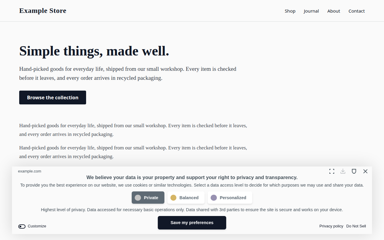
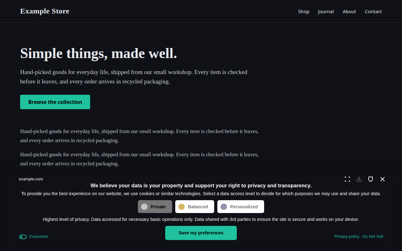
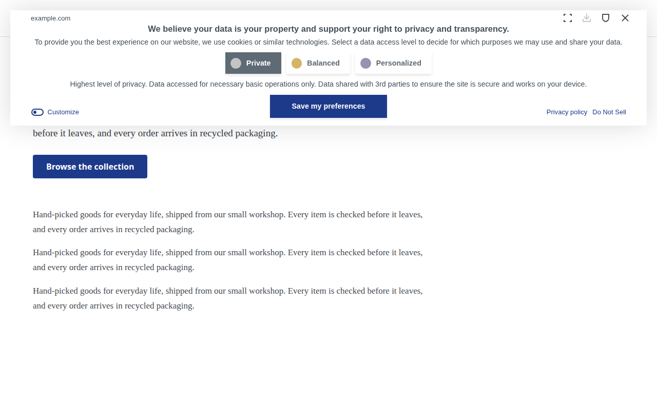
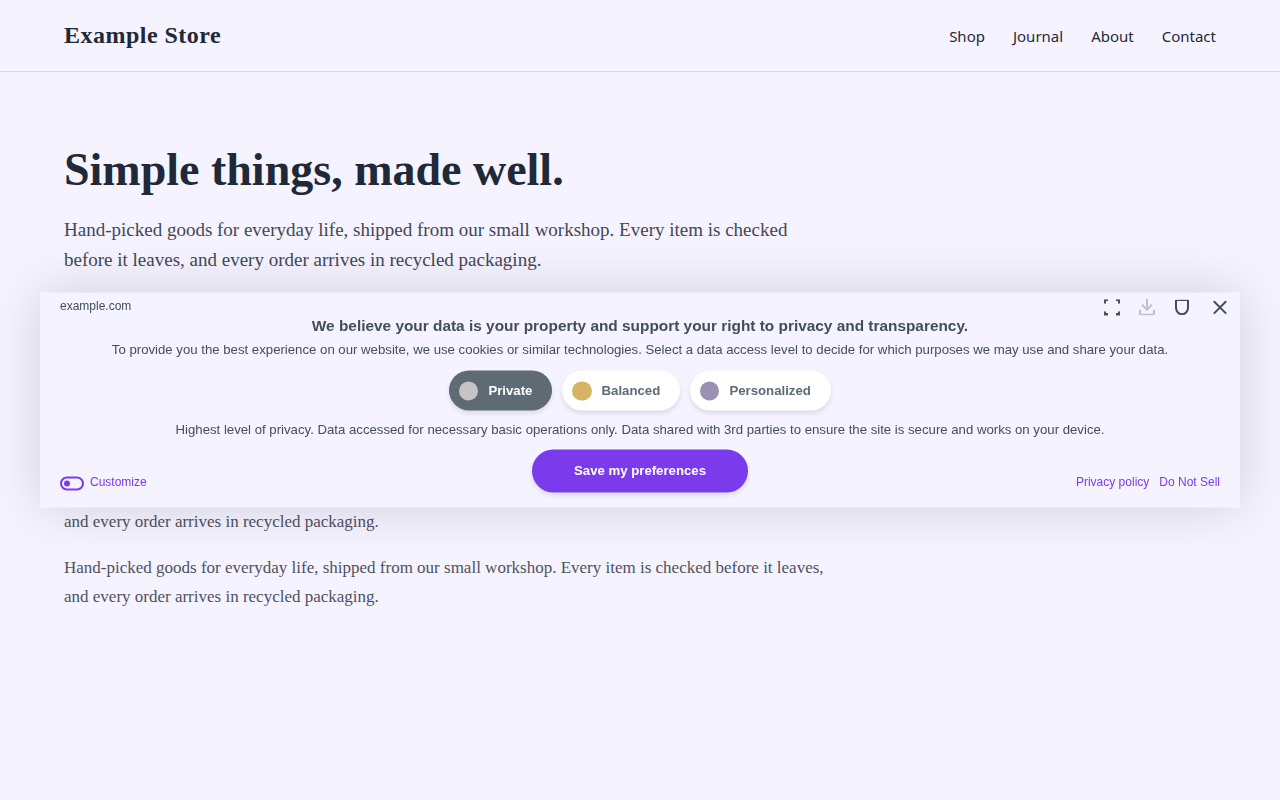
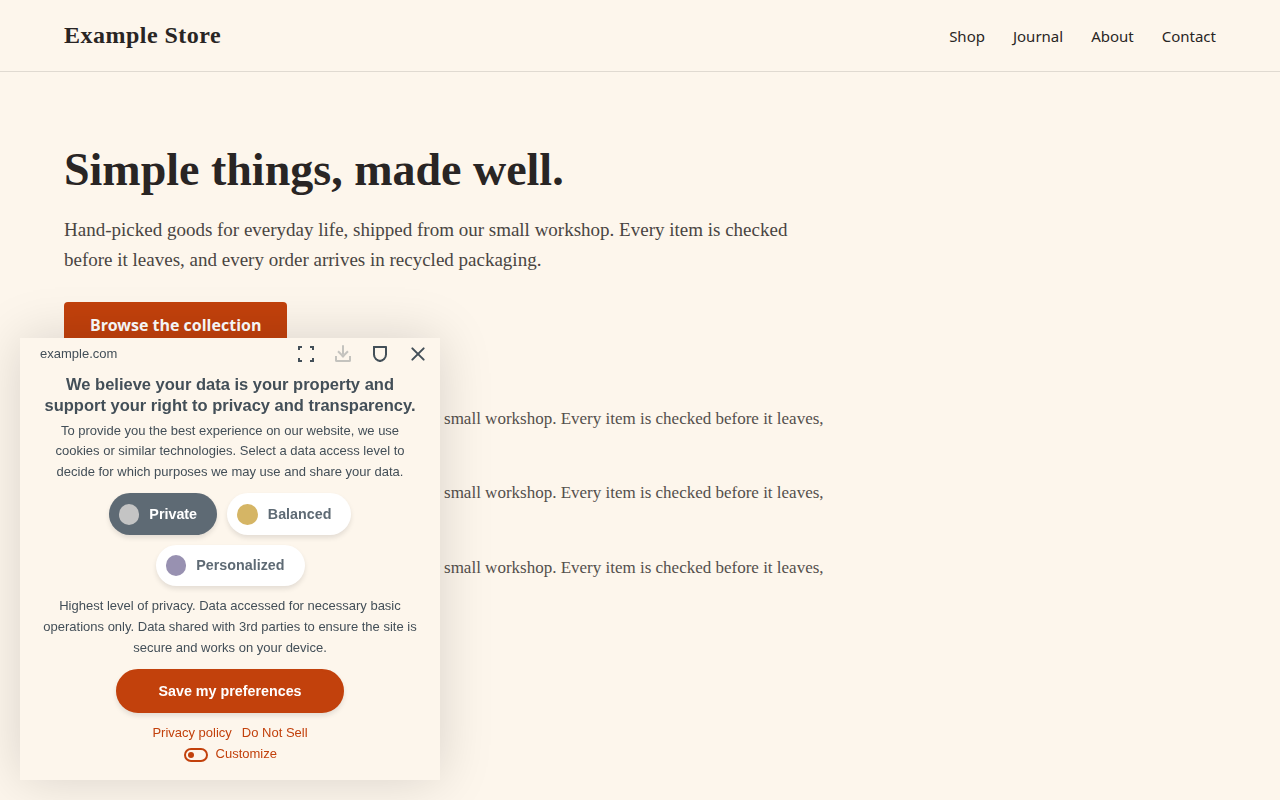
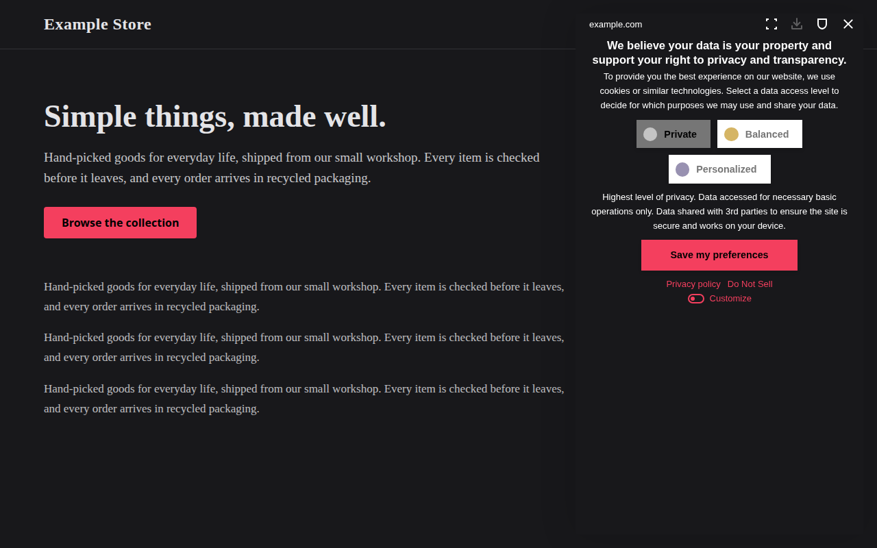
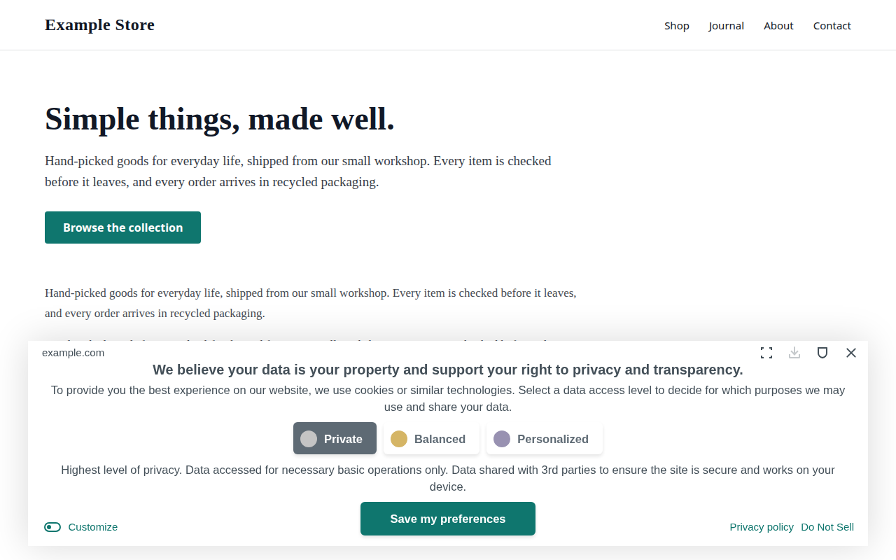
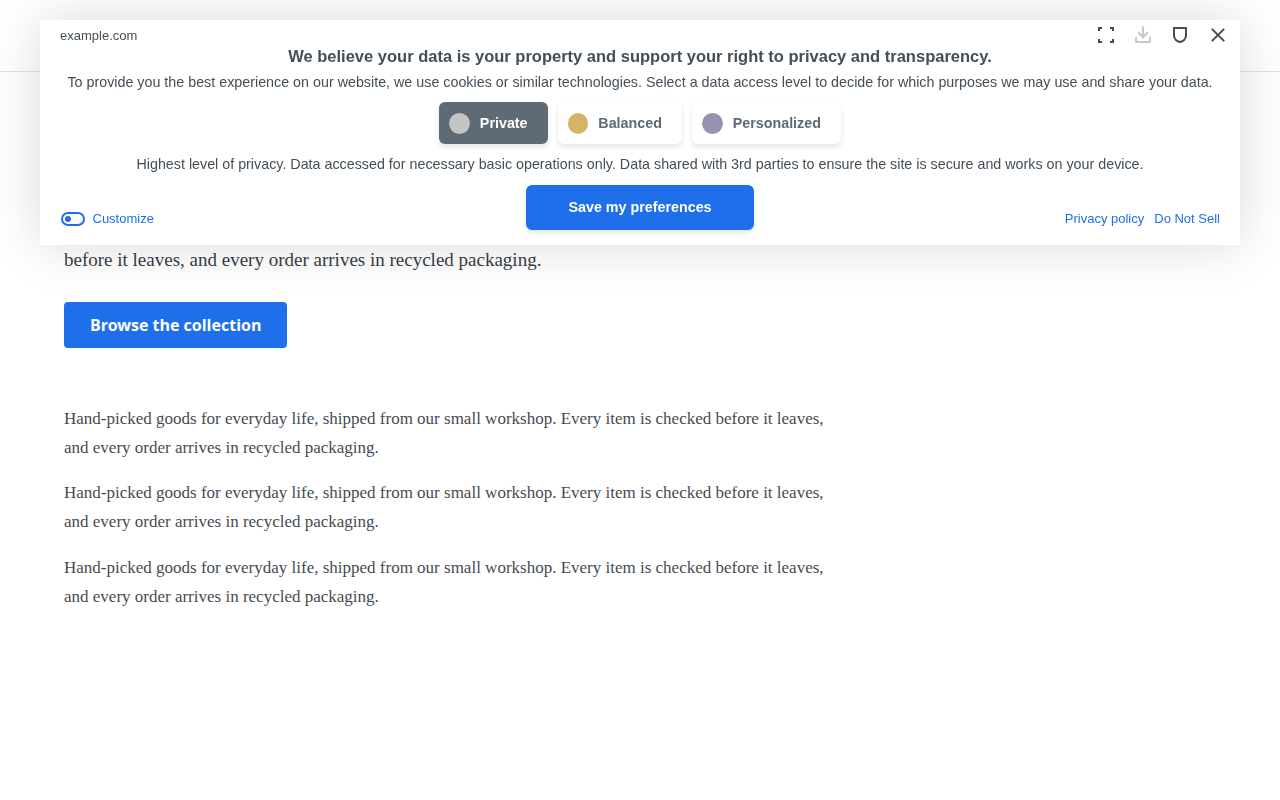
Eight example designs for the Cookie Compliance banner. Each one is a screenshot of the real widget in preview mode, using one of its real layouts. The build checks body text and headings against the banner colour, and the button label, the selected and unselected level labels and the links against their backgrounds, at WCAG AA (4.5:1).
These designs are for the v1 banner, the default. For the opt-in v2 banner and its compact style, see the v2 banner design gallery.
Design JSON
{
  "position": "bottom",
  "displayType": "floating",
  "bannerOpacity": 1,
  "primaryColor": "#111827",
  "btnTextColor": "#ffffff",
  "bannerColor": "#fafafa",
  "borderColor": "#5e6a74",
  "textColor": "#434f58",
  "headingColor": "#434f58",
  "btnBorderRadius": "6px",
  "textSize": "13px",
  "headingSize": "15px"
}
Design JSON
{
  "position": "bottom",
  "displayType": "fixed",
  "bannerOpacity": 1,
  "primaryColor": "#20c19e",
  "btnTextColor": "#000000",
  "bannerColor": "#0f1117",
  "borderColor": "#767676",
  "textColor": "#ffffff",
  "headingColor": "#ffffff",
  "btnBorderRadius": "6px",
  "textSize": "13px",
  "headingSize": "15px"
}
Design JSON
{
  "position": "top",
  "displayType": "fixed",
  "bannerOpacity": 1,
  "primaryColor": "#1d3a8a",
  "btnTextColor": "#ffffff",
  "bannerColor": "#ffffff",
  "borderColor": "#5e6a74",
  "textColor": "#434f58",
  "headingColor": "#434f58",
  "btnBorderRadius": "0px",
  "textSize": "13px",
  "headingSize": "15px"
}
Design JSON
{
  "position": "center",
  "displayType": "floating",
  "bannerOpacity": 1,
  "primaryColor": "#7c3aed",
  "btnTextColor": "#ffffff",
  "bannerColor": "#f5f3ff",
  "borderColor": "#5e6a74",
  "textColor": "#434f58",
  "headingColor": "#434f58",
  "btnBorderRadius": "25px",
  "textSize": "12px",
  "headingSize": "14px"
}
Design JSON
{
  "position": "left",
  "displayType": "floating",
  "bannerOpacity": 1,
  "primaryColor": "#c2410c",
  "btnTextColor": "#ffffff",
  "bannerColor": "#fdf6ec",
  "borderColor": "#5e6a74",
  "textColor": "#434f58",
  "headingColor": "#434f58",
  "btnBorderRadius": "25px",
  "textSize": "13px",
  "headingSize": "15px"
}
Design JSON
{
  "position": "right",
  "displayType": "fixed",
  "bannerOpacity": 1,
  "primaryColor": "#f43f5e",
  "btnTextColor": "#000000",
  "bannerColor": "#18181b",
  "borderColor": "#767676",
  "textColor": "#ffffff",
  "headingColor": "#ffffff",
  "btnBorderRadius": "0px",
  "textSize": "13px",
  "headingSize": "15px"
}
Design JSON
{
  "position": "bottom",
  "displayType": "floating",
  "bannerOpacity": 1,
  "primaryColor": "#0f766e",
  "btnTextColor": "#ffffff",
  "bannerColor": "#ffffff",
  "borderColor": "#5e6a74",
  "textColor": "#434f58",
  "headingColor": "#434f58",
  "btnBorderRadius": "6px",
  "textSize": "15px",
  "headingSize": "18px"
}
Design JSON
{
  "position": "top",
  "displayType": "floating",
  "bannerOpacity": 1,
  "primaryColor": "#1f6feb",
  "btnTextColor": "#ffffff",
  "bannerColor": "#ffffff",
  "borderColor": "#5e6a74",
  "textColor": "#434f58",
  "headingColor": "#434f58",
  "btnBorderRadius": "6px",
  "textSize": "13px",
  "headingSize": "15px"
}Apply a design to your live banner
A design block set on your own page is overwritten by your app's published configuration a moment after the banner loads. To use one of these designs on a live banner:
- Dashboard: set the same values in your app's banner design settings, then publish.
- MCP server: call
account.previewDesignChangewith your AppID and thedesignobject, show the before/after to the site owner, then callaccount.updateDesignwith the same object and the returnedpreviewToken.
Never add a design block to the install snippet. To derive a design from your own site's colours instead, follow skills/match-site-design/SKILL.md.